Gallery Wall Mistakes to Avoid (Plus How to Fix Them)
A gallery wall can be one of the most beautiful, personal things in your home. But if something feels a little off about yours (or you have been putting off starting one because you are worried about messing it up), you are not alone. Today I am sharing the seven most common gallery wall mistakes I see, plus exactly how to fix each one so your wall looks pulled together and intentional.
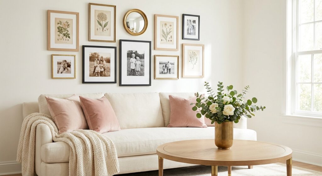
I actually put off hanging our gallery wall in the living room for months because I was so nervous about getting it wrong. Four kiddos running around, limited time, and the idea of putting a bunch of holes in the wall only to realize everything was crooked? No thank you. But once I learned a few simple rules, it honestly was not that hard. And if I can do it during nap time with a toddler on my hip, I promise you can do this too.
Mistake #1: Hanging Everything Too High
This is probably the most common gallery wall mistake out there, and I completely understand why it happens. Our instinct is to hang art up high, but the result is a wall that feels disconnected from the rest of the room.
The fix: Use the 57-inch rule. The center of your gallery wall grouping should sit about 57 to 60 inches from the floor. This is the standard that museums use, and it works beautifully at home too. If your gallery wall is going above a sofa or piece of furniture, keep the bottom edge of the lowest frame about 6 to 10 inches above the furniture. This creates a visual connection between the art and what is below it instead of everything floating up near the ceiling.
Here is the thing: once you know this rule, you will start noticing it everywhere. Restaurants, doctor’s offices, even friends’ houses. You will see art hanging way too high and you will not be able to unsee it.
Mistake #2: Getting the Spacing Wrong
Spacing can make or break a gallery wall. Frames that are crammed too close together look cluttered, and frames that are spread too far apart look like they do not belong together at all.
The fix: Aim for 2 to 3 inches between each frame. This is the sweet spot that lets each piece breathe while still reading as one cohesive grouping. If you are working with larger frames (over 24 inches), you can stretch to 4 to 6 inches between pieces.
A trick that has worked so well for me is cutting a piece of cardboard to your desired spacing width. Then just hold it between frames as you hang them. It keeps everything consistent without having to measure every single gap.
Mistake #3: Using All the Same Size Frames
I think this one trips people up because it seems like using matching frames in the same size would look clean and polished. And while a uniform grid can look great in certain spaces, most gallery walls need variety to feel interesting.
The fix: Mix your sizes. Start with one or two larger anchor pieces (think 16×20 or bigger) and then fill in around them with medium frames (8×10 to 11×14) and smaller ones (5×7 to 6×8). This gives your eye a natural path to follow and creates that layered, collected look that is so popular right now.
You can even add different shapes to the mix. A round mirror, an oval frame, or a small wall shelf with a little plant on it can break up the rectangles and add so much visual interest.
Mistake #4: Skipping the Planning Step
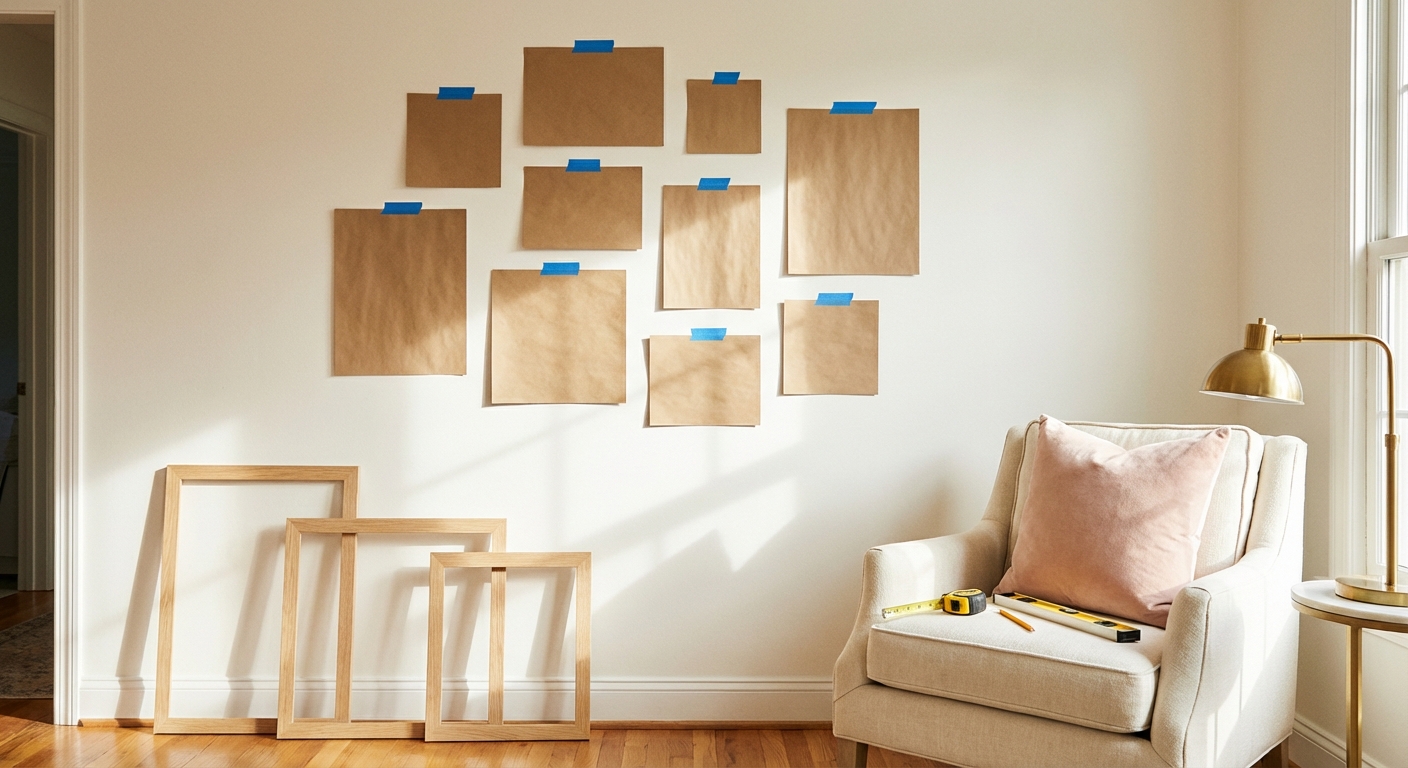
This is the mistake that leads to all the extra holes in your wall (and the frustration that comes with them). I know it is tempting to just start hammering nails, but taking 20 minutes to plan your layout first will save you so much time and stress.
The fix: The paper template method is a total game changer, and it is what I use every single time. Here is how it works:
- Trace each frame onto kraft paper or newspaper and cut out the shapes.
- Label each cutout with the frame color and whether it is portrait or landscape.
- Use painter’s tape to arrange the paper templates on your wall.
- Start with your largest piece first and work outward, keeping that 2 to 3 inch spacing.
- Live with it for a day or two. Walk past it at different times. See how it feels.
- Once you love the arrangement, mark where the nail needs to go on each paper template.
- Hammer your nails right through the paper, then peel the paper away and hang your frames.
This method costs basically nothing (you probably already have newspaper and painter’s tape), and it means you only put holes exactly where you need them. If you have littles running around like I do, you can even do the floor-layout version first. Use painter’s tape to outline your wall space on the floor, then arrange all your frames within that outline until you find what you like.
Mistake #5: Overcrowding the Wall
More is not always more when it comes to gallery walls. I have seen walls where every single inch is covered, and instead of feeling curated and beautiful, it just feels overwhelming.
The fix: Your gallery wall should cover roughly two-thirds of the available wall space, not all of it. If it is above your sofa, aim for the gallery to be about two-thirds to three-quarters the width of the couch. And leave at least 6 to 8 inches of empty wall space around the outside edges of your arrangement.
Here is a good gut check: if you step back and your eye does not know where to land first, you probably have too much going on. Remove a piece or two and see if it feels better. You can always add that piece to another wall in your home.
One more tip: try to keep it to one gallery wall per room. If you have a beautiful gallery display above the sofa, let the other walls breathe with simpler art or nothing at all. It makes your gallery wall feel more special and intentional.
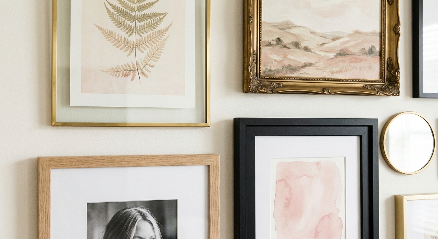
Mistake #6: No Cohesive Thread Tying It Together
A gallery wall should feel collected, not random. If your pieces do not have anything in common, the whole thing can feel disjointed no matter how perfectly you space and hang them.
The fix: You do not need everything to match (in fact, please do not make everything match, which is our next mistake). But you do need at least one unifying element. Here are some options:
- Color palette: Pick 2 to 3 colors that repeat throughout your pieces. This is probably the easiest approach.
- Frame finish: Stick to 2 to 3 frame finishes max. I love the combination of black frames, natural wood, and brass or gold.
- Subject matter: Family photos, botanical prints, travel photography, vintage art. Pick a general theme.
- Mat color: Using the same white mat across different frame styles ties everything together beautifully.
For our gallery wall, I stuck with a warm neutral color palette and mixed black frames with light wood and a couple of brass ones. The art itself is a mix of family photos, a botanical print, and a vintage-looking landscape. They are all different, but the warm tones and similar frame finishes make it feel like they belong together.
Mistake #7: Making Everything Match Perfectly
This might sound like it contradicts mistake number six, but hear me out. There is a huge difference between cohesive and matching. A gallery wall where every single frame is identical and every print is from the same set can end up looking like a display at a furniture store instead of a real home.
The fix: Embrace the mix. The biggest gallery wall trend right now is the “collected over time” look, where your wall feels like it has been curated piece by piece rather than ordered in one online shopping cart. Here is how to get there:
- Mix 2 to 3 frame finishes instead of using all the same
- Include different types of art (photos, prints, maybe a small mirror or woven basket)
- Vary the sizes and orientations (some portrait, some landscape)
- Add dimension with a shelf, a decorative plate, or a three-dimensional piece
The rule of repetition is your friend here. One random gold frame in a wall of all black frames looks like a mistake. But scatter two or three gold frames throughout and it looks completely intentional.
Budget-Friendly Gallery Wall Sources
You do not need to spend a fortune to create a gallery wall you love. Here are my favorite affordable sources for frames:
- IKEA: The FISKBO frames are a favorite for good reason. They come in multiple sizes, and you can do an entire gallery wall for around $50 to $100. The MOSSLANDA picture ledges (around $6 to $10 each) are also great if you want the flexibility to swap out art without making new holes.
- Target: Their Threshold 16×20 frames (around $28 each) look way more expensive than they are, and they frequently have buy-one-get-one deals. The light wood frames with mats are especially nice.
- Walmart: The Mainstays 7-Piece Gallery Wall Frame Set (around $26) is an incredible value that includes multiple sizes and hanging templates.
- Amazon: Gallery wall frame sets are a great starting point. The Gallery Perfect 7-Piece Set (around $40) even comes with a hanging template. Multi-packs are always more cost-effective than buying individually.
- HomeGoods and TJ Maxx: The best place to find unique brass and gold frames, ornate vintage-inspired frames, and interesting pieces you will not see everywhere else.
A Few Final Tips
If you already have a gallery wall that is not working, you do not have to start completely over. Take everything down, patch any holes that will not be reused, and re-plan using the paper template method. Sometimes just adjusting the height or spacing fixes everything.
If you are starting from scratch, do not feel like you need to fill the whole wall on day one. Start with three to five pieces you truly love and build from there over time. This is actually the most budget-friendly approach too, and it gives your gallery wall that authentic, collected feel that is so beautiful.
If you are a mama with littles, consider using Command Picture Hanging Strips instead of nails, especially at lower heights. They hold surprisingly well, they are renter-friendly, and if a frame falls during an enthusiastic game of indoor tag, at least there is no nail left behind in the wall. Also, skip real glass frames at kid height and look for frames with Plexiglass or acrylic fronts instead.
Creating a gallery wall that feels like you is one of the most rewarding decorating projects you can do. It does not have to be perfect, and it definitely does not have to be expensive. Just avoid these seven mistakes, take the time to plan, and you will end up with a wall that makes you smile every time you walk past it.